Executive Summary
The Context
The VRR (Verkehrsverbund Rhein-Ruhr) application is the mobility backbone for the NRW region, facilitating travel for millions. However, despite having over "1 million downloads", the legacy application suffered from low retention and poor ratings due to outdated architecture and lack of essential features.
The Mission
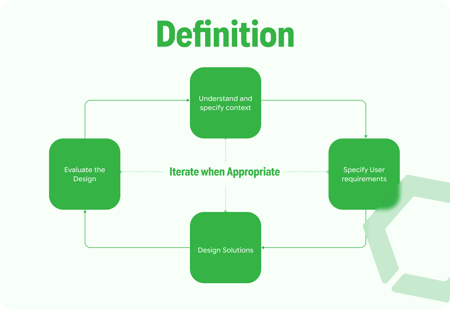
To redesign the VRR mobile experience using a "Human-Centered Design (HCD)" approach. The goal was to transform a functional utility into an intuitive, accessible companion for daily commuters, students, and international newcomers.
Problem Definition
Through initial audits, we identified that the existing app was failing its core user base—particularly students and newcomers who rely on public transit.
Core Pain Points:
- Cognitive Overload: Cluttered navigation and crowded iconography made the app difficult to parse quickly.
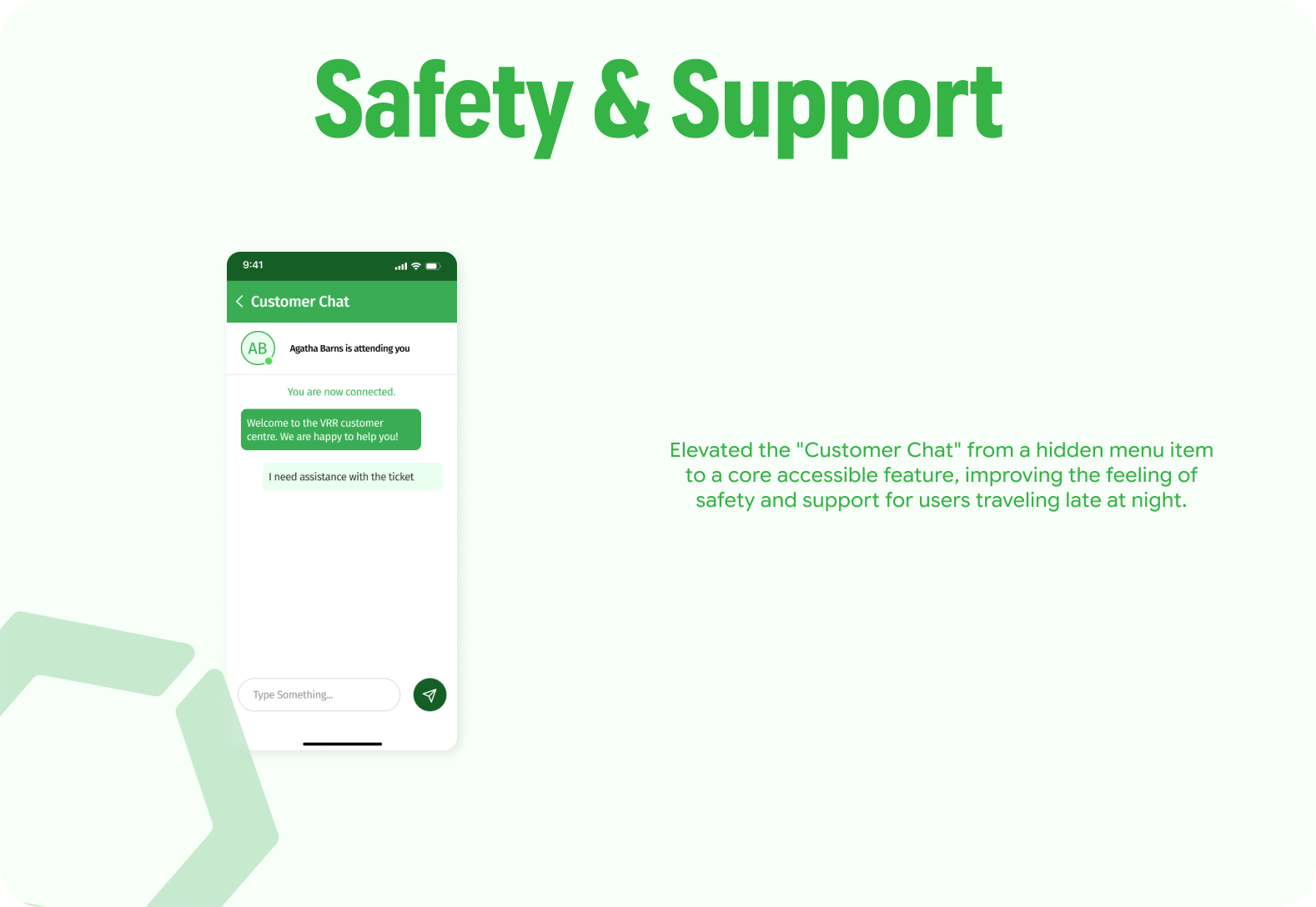
- Feature Gaps: Lack of real-time updates (delays/cancellations) and push notifications.
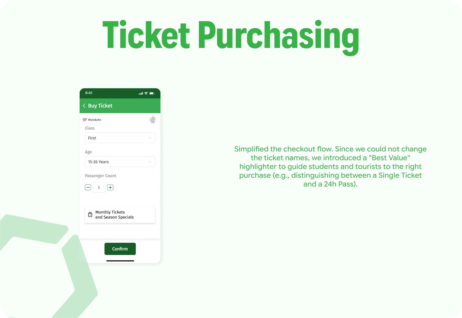
- Systemic Complexity: Ticket classification was confusing for non-locals.
- Fragmented Experience: Journey planning and map tracking existed in silos, requiring users to memorize routes rather than follow them.
Research & Strategy
We adopted a dual-track agile process, combining qualitative user research with competitive benchmarking to validate our hypotheses.
Competitor Analysis
We benchmarked VRR against local and global standards to identify the "gap" in the market.
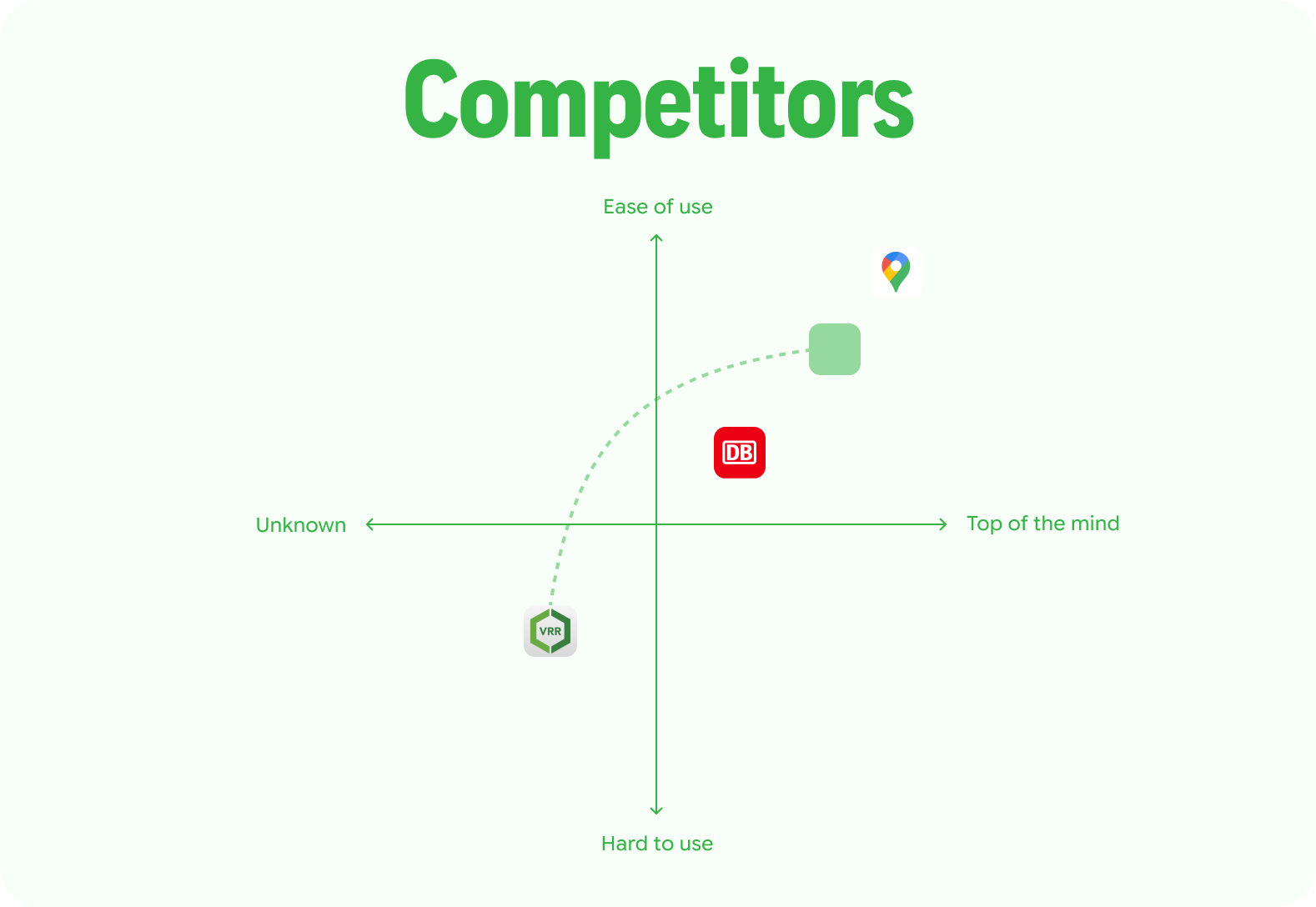
- VRR (Original): Strong local data, but poor usability.
- Deutsche Bahn: Comprehensive, but often overwhelming for short regional trips.
- Google Maps: Excellent multi-modal interface, but lacks specific regional tariff/ticket integration.
User Research
We conducted surveys and interviews with 10 participants (Students/Commuters, aged 20–28) to build accurate personas.
Key Findings:
- 90% reported missing critical features (real-time alerts).
- 60% found the current navigation unintuitive.
- Trust Issues: 40% complained about data accuracy, leading them to use competitor apps.
The Design Process
Ideation & Low-Fidelity
We moved from hand-sketched flows to a clickable low-fidelity prototype to test the information architecture.
Conceptual Shifts:
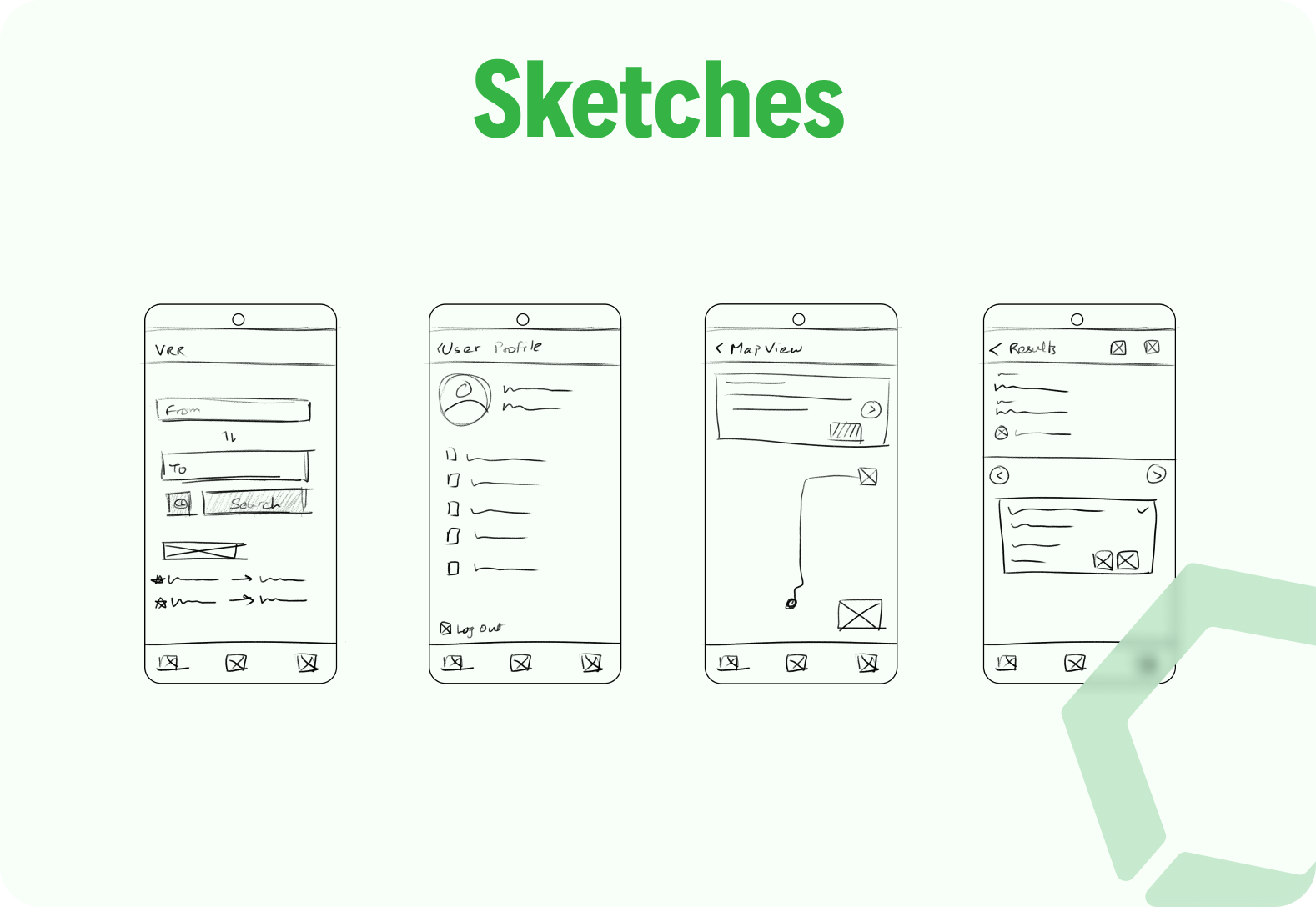
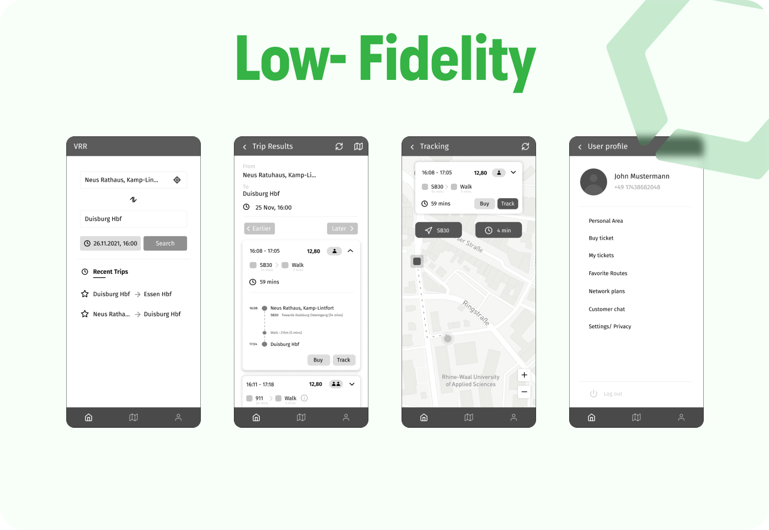
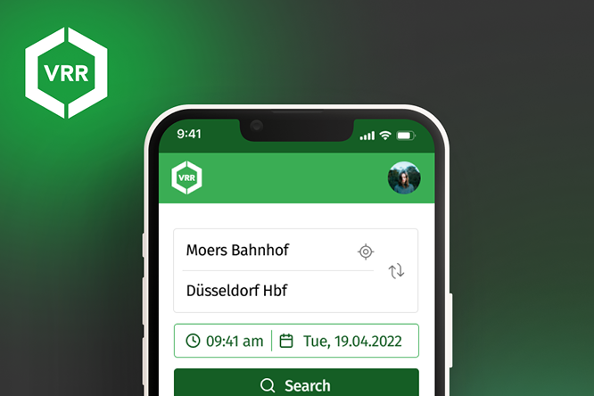
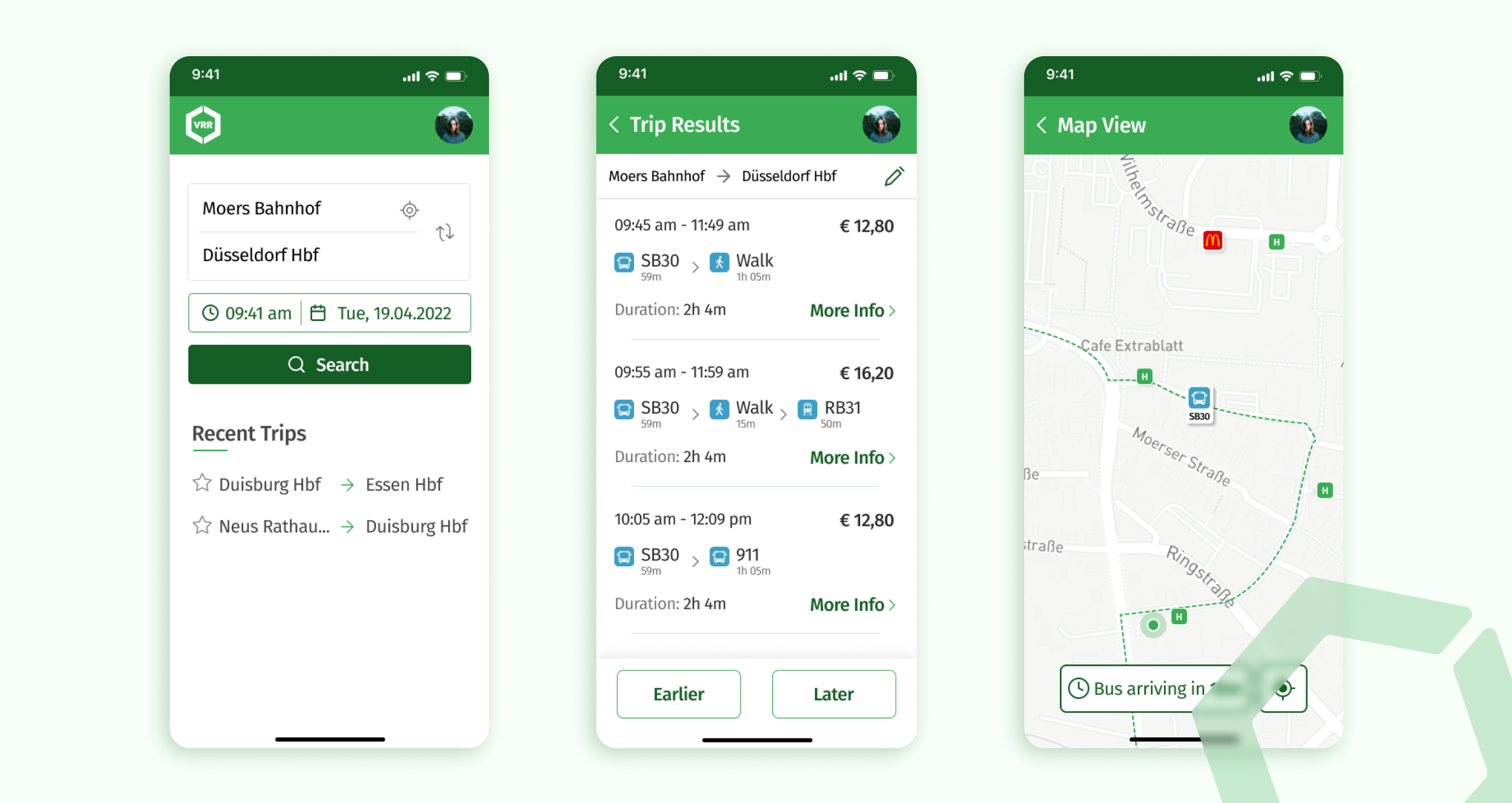
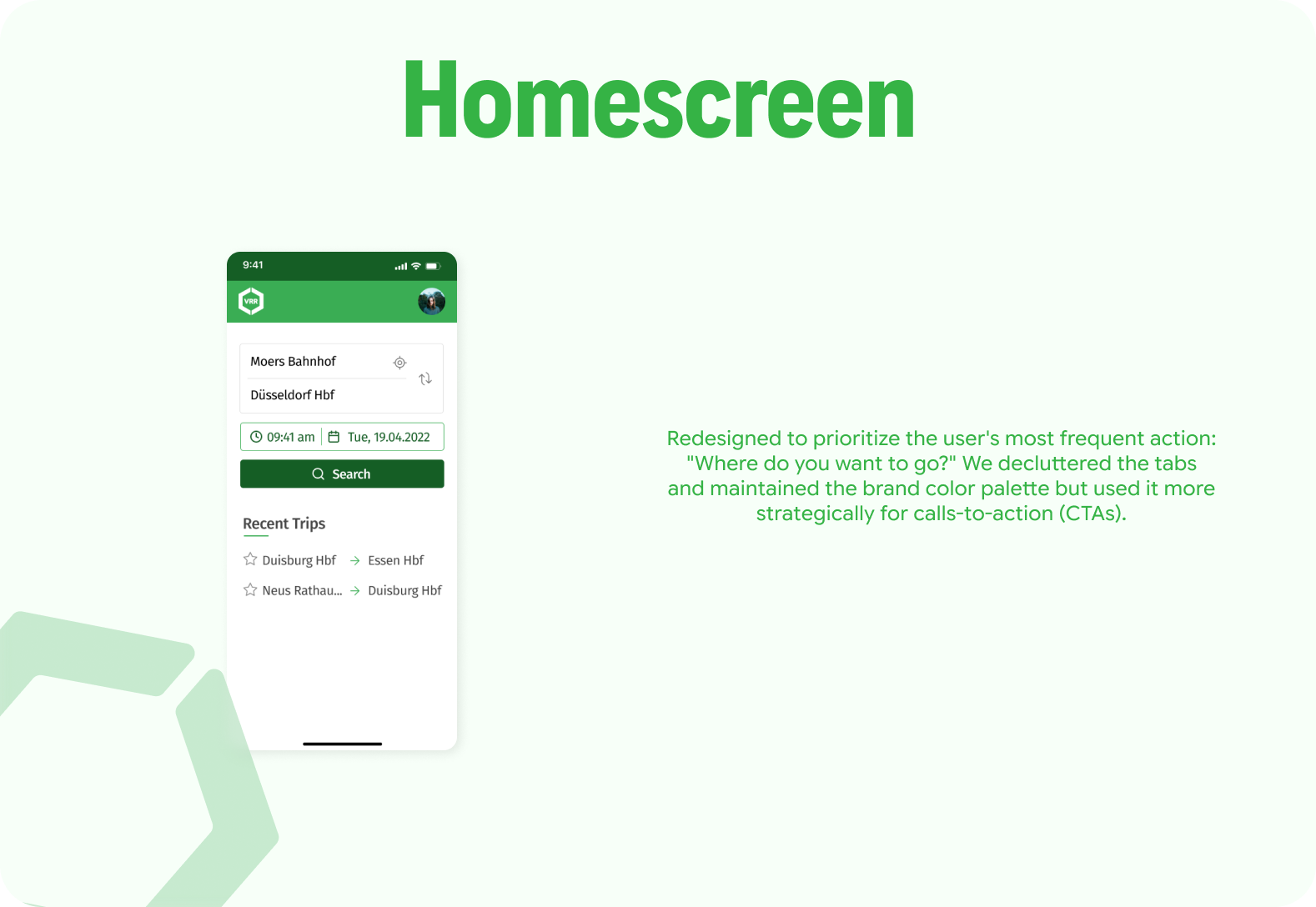
- Home Page: Shifted from a menu-heavy list to a "search-first" dashboard.
- Trip Results: Introduced clear visual separation between options to reduce scanning time.
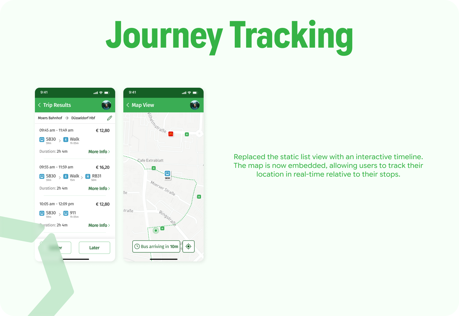
- Integrated Tracking: Proposed merging the map view directly into the trip details to prevent context switching.
Usability Testing (Round 1)
We tested the Low-Fi concepts with 3 participants using the "Think Aloud" protocol.
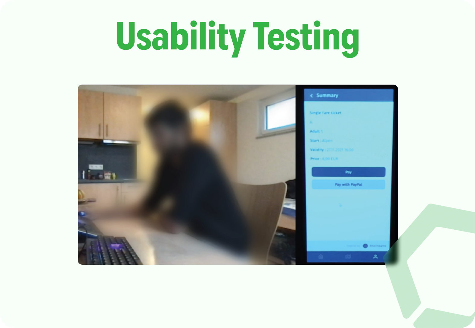
Critical Feedback & Iteration:
- Feedback: "The map flow is confusing; why is it a separate screen?"
- Iteration: We integrated the map as a dynamic component within the journey timeline.
- Feedback: "The icons are too crowded."
- Iteration: We adopted a cleaner, minimalist icon set and increased whitespace.
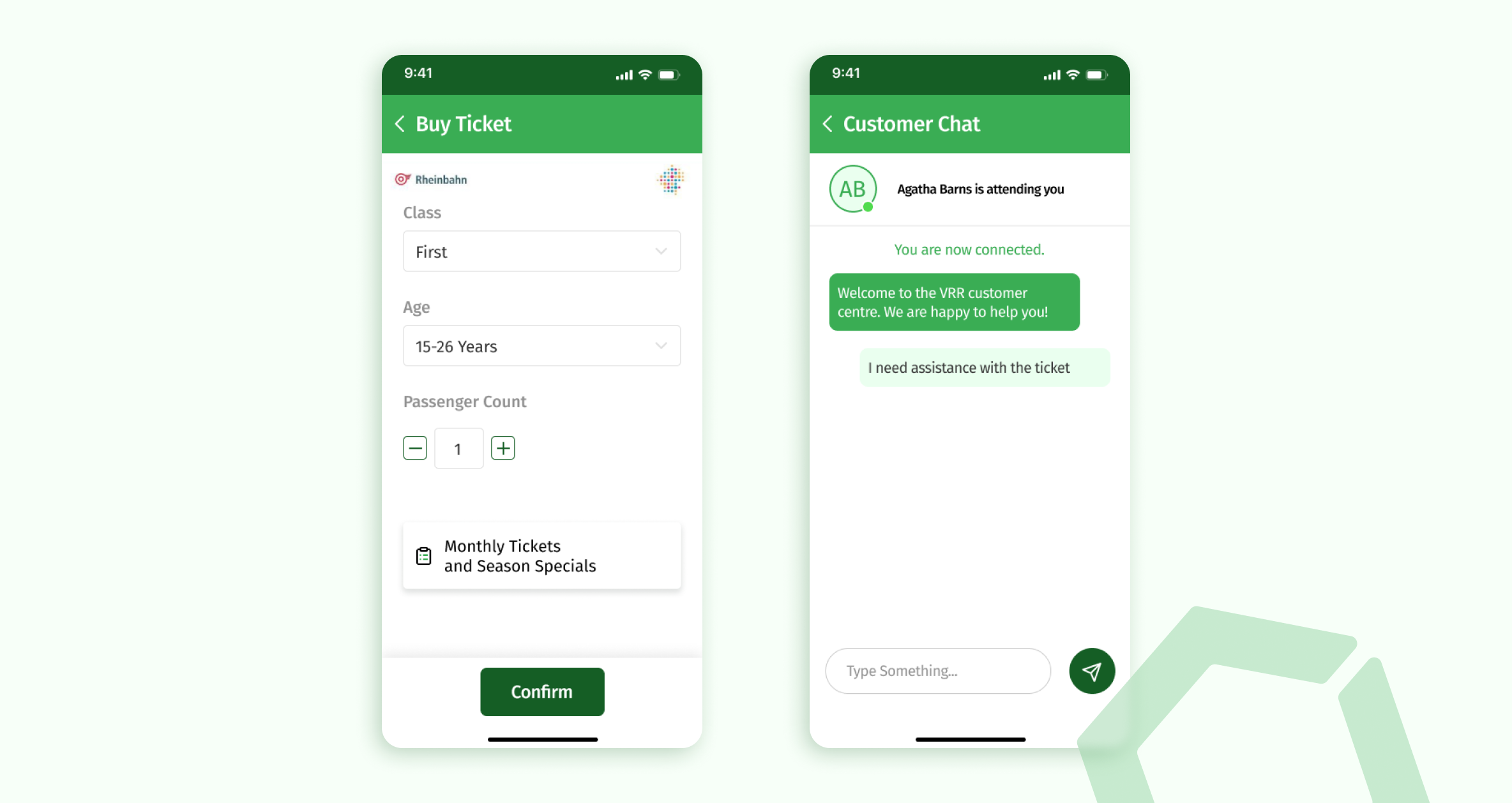
- Feedback: "I don't understand the ticket names."
- Constraint Handling: While users found ticket names confusing, we identified this was a regulatory naming convention in Germany that could not be changed. Instead, we added contextual tooltips and clear descriptions to explain the tickets without changing the official names.
High-Fidelity & Solution
The final high-fidelity design focused on accessibility, visual hierarchy, and strictly adhering to atomic design principles.
Validation & Results
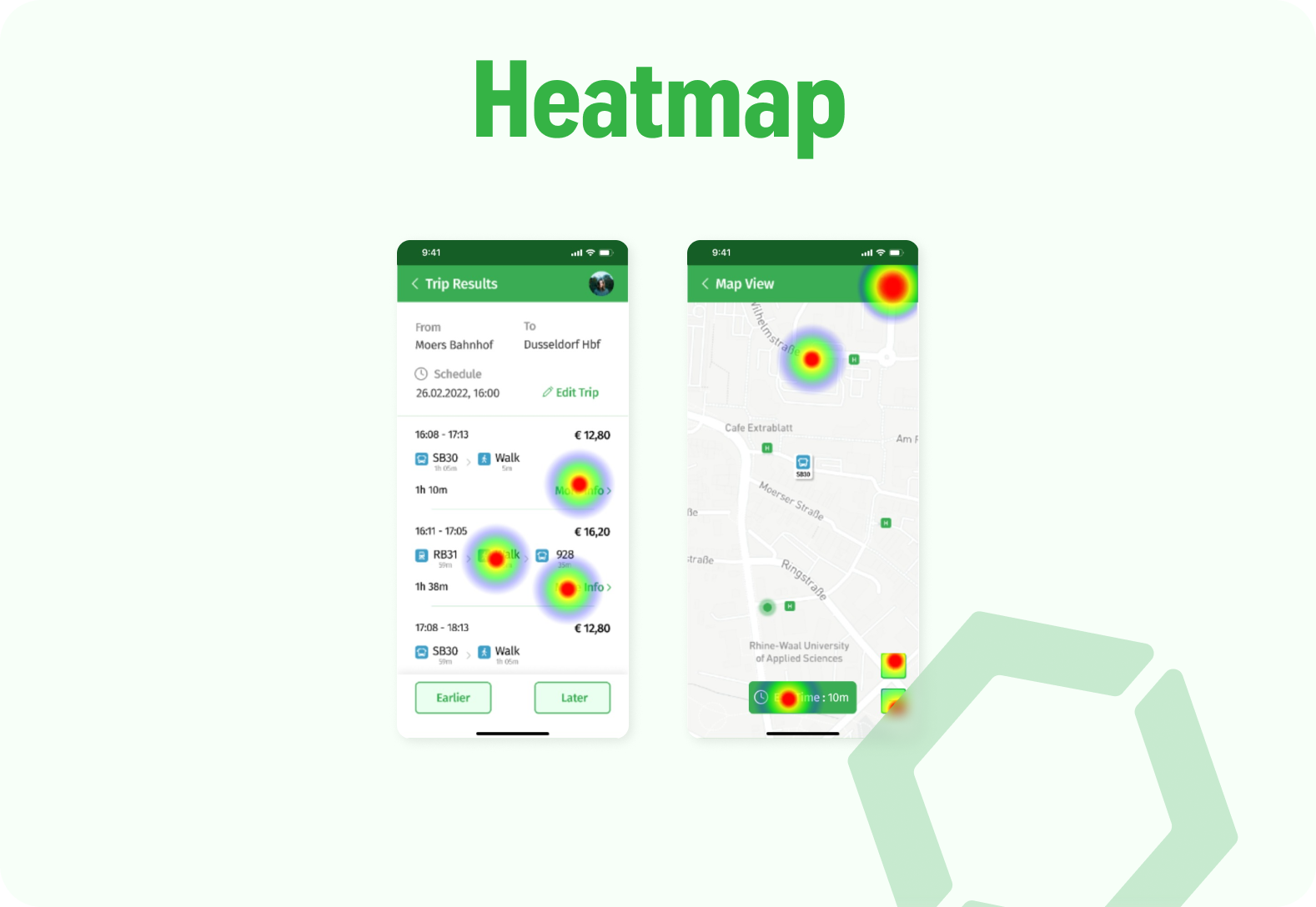
We validated the final design through remote moderated testing with 7 users and maze heatmap analytics.
Outcomes:
- Task Completion: significantly faster journey planning times.
- Error Reduction: "Send Button" confusion was eliminated by updating the micro-copy and button state.
- Navigation: Users successfully navigated between the dashboard and active trips without getting lost.
Business Strategy & Future Roadmap
Beyond the interface, we developed a strategy to ensure the app's longevity and financial viability for VRR.
Revenue & Growth
- HandyTicket Integration: Streamlining the payment gateway to reduce cart abandonment.
- Market Expansion: Specifically targeting international students and expats in NRW by adding multilingual support, expanding the user base beyond native German speakers.
- B2B Opportunities: A framework for corporate partnerships (JobTickets) managed directly inside the app.
Future Roadmap
- AI Recommendations: Smart routing based on past behavior.
- Voice Control: Accessibility features for visually impaired commuters.
- Cross-Border Travel: Integration with neighboring transport associations.
Final Thoughts
This project highlighted the importance of evidence-based design. By rigorously testing our prototypes, we uncovered that users didn't just want a "prettier" app—they wanted reliability. The redesign transforms the VRR app from a source of frustration into a dependable travel companion for the NRW region.
If you're interested