
The Challenge
The Problem: The Dopamine Loop
In an era of "doomscrolling" and "brainrot," users are losing hours to unintentional social media usage. Social media algorithms are designed to exploit dopamine reward mechanisms, leading to anxiety, reduced attention spans, and sleep disruption.
The Context
As part of my Master's Thesis at Rhein-Waal University of Applied Sciences (Germany), I investigated the efficacy of mindfulness-based interventions on screen time. My research analyzed existing market solutions (like OneSec) and identified critical gaps:
- Android Neglect: Many existing tools were buggy or unoptimized for the Android ecosystem.
- Data Anxiety: Users were hesitant to grant permissions to apps that might upload usage data to the cloud.
- Alert Fatigue: Users found constant interruptions annoying rather than helpful without proper context or customization.
Research & Discovery
Thesis-Backed Insights
I utilized a mixed-method approach involving the PANAS (Positive and Negative Affect Schedule) and MAAS (Mindful Attention Awareness Scale) to gather data.
- Key Finding 1: Mindfulness interventions do reduce screen time, but users often rebound if the intervention is too aggressive.
- Key Finding 2: Visualizing data is crucial. Users needed granular "Weekly Insights" to understand their behavior patterns, not just a total timer.
- Key Finding 3: Privacy is paramount. In the EU market specifically, users demand transparency regarding Accessibility and Usage permissions.
Design Opportunity: Create a "Privacy-First" Android-native application that uses gentle friction (mindfulness) rather than just brute-force blocking, built entirely on local storage.
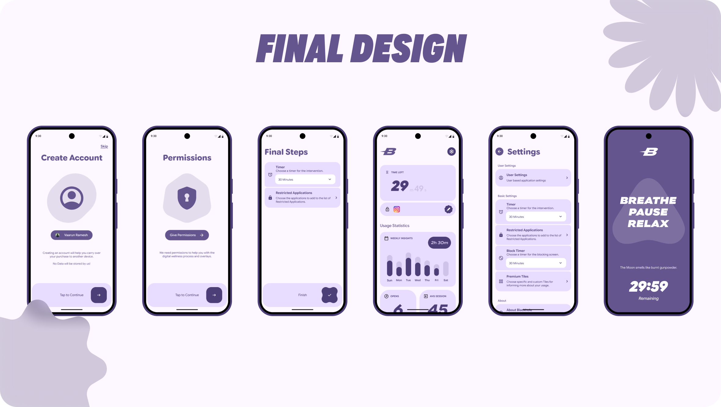
The Solution: Blackhole
Blackhole is a mindful intervention tool that adds a layer of consciousness between the user and their impulse to scroll.
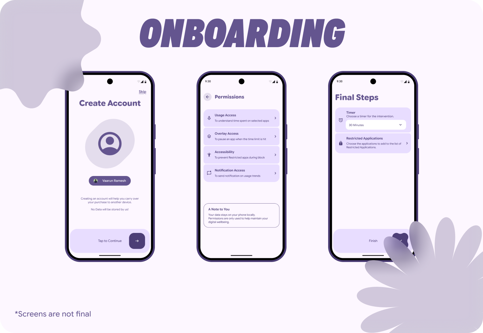
User Flow and Onboarding
Transparent Permissions: The onboarding flow explicitly explains why sensitive permissions (Overlay, Usage Access) are needed.
UX Decision: Instead of a generic system prompt, I designed dedicated cards explaining "Data stays on your phone locally." This builds immediate trust.
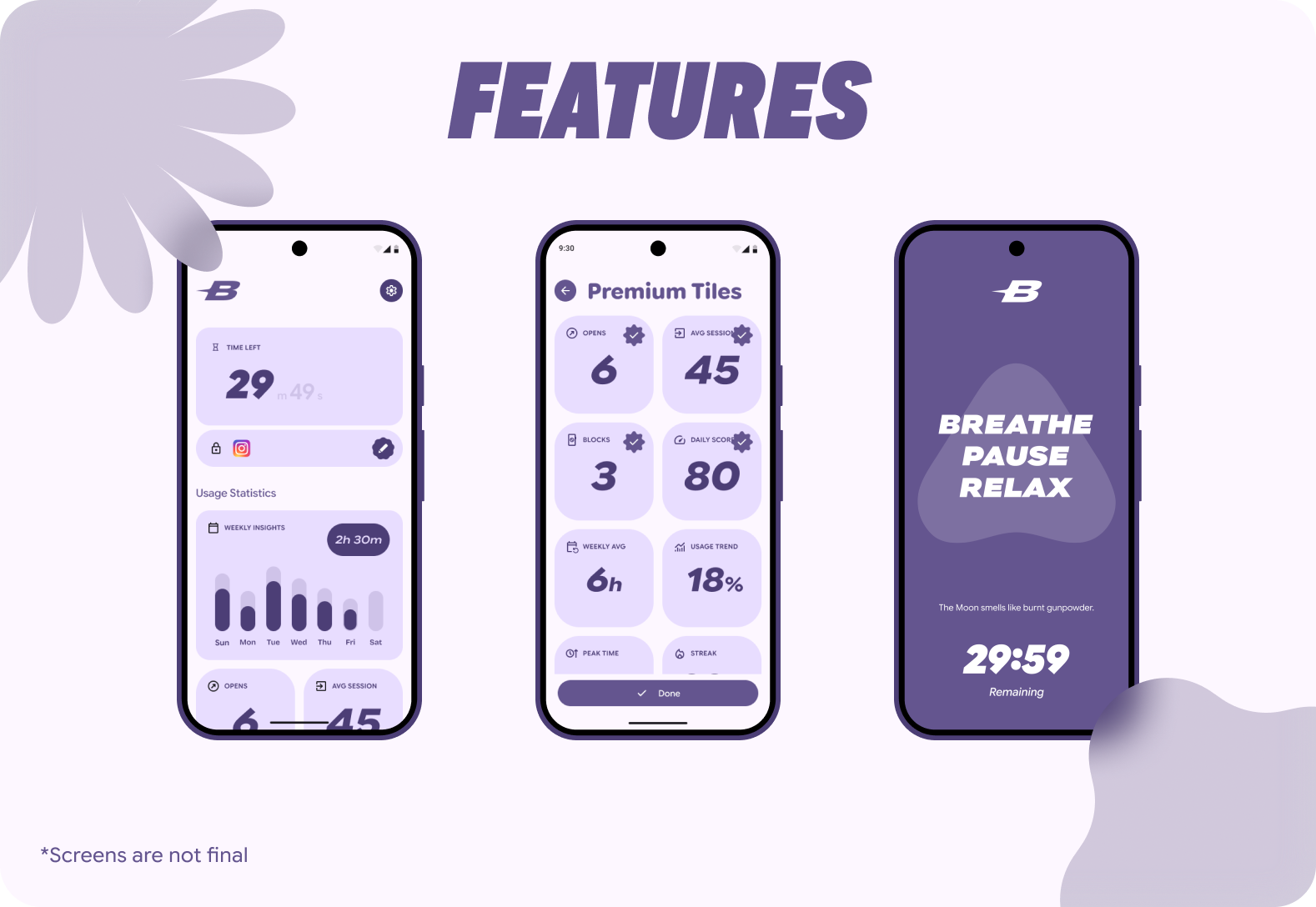
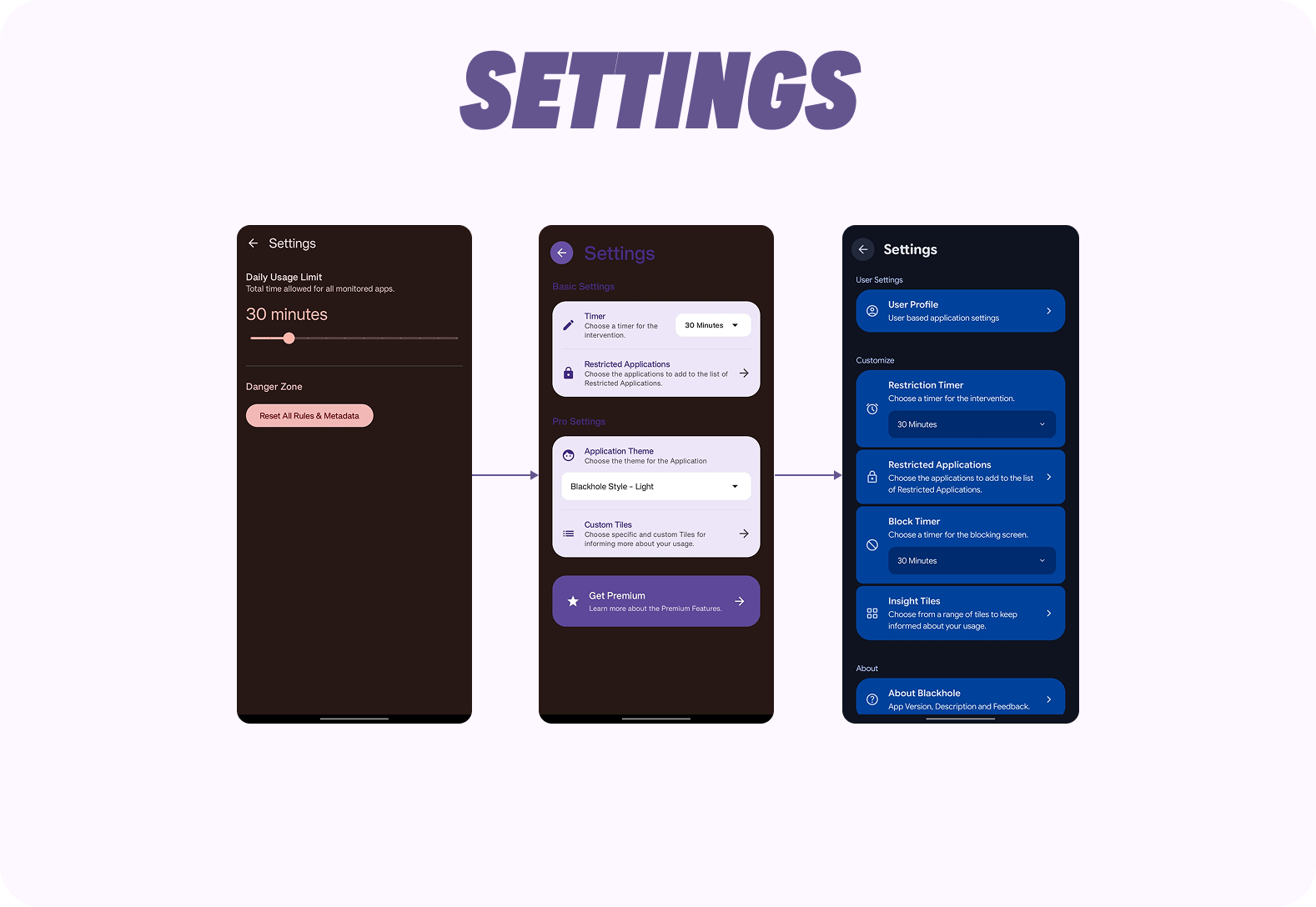
Core Features
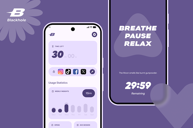
The Restriction Timer: Users choose a session length (e.g., 30 mins). This shifts the mental model from "I am blocked forever" to "I am choosing to consume content for a specific time."
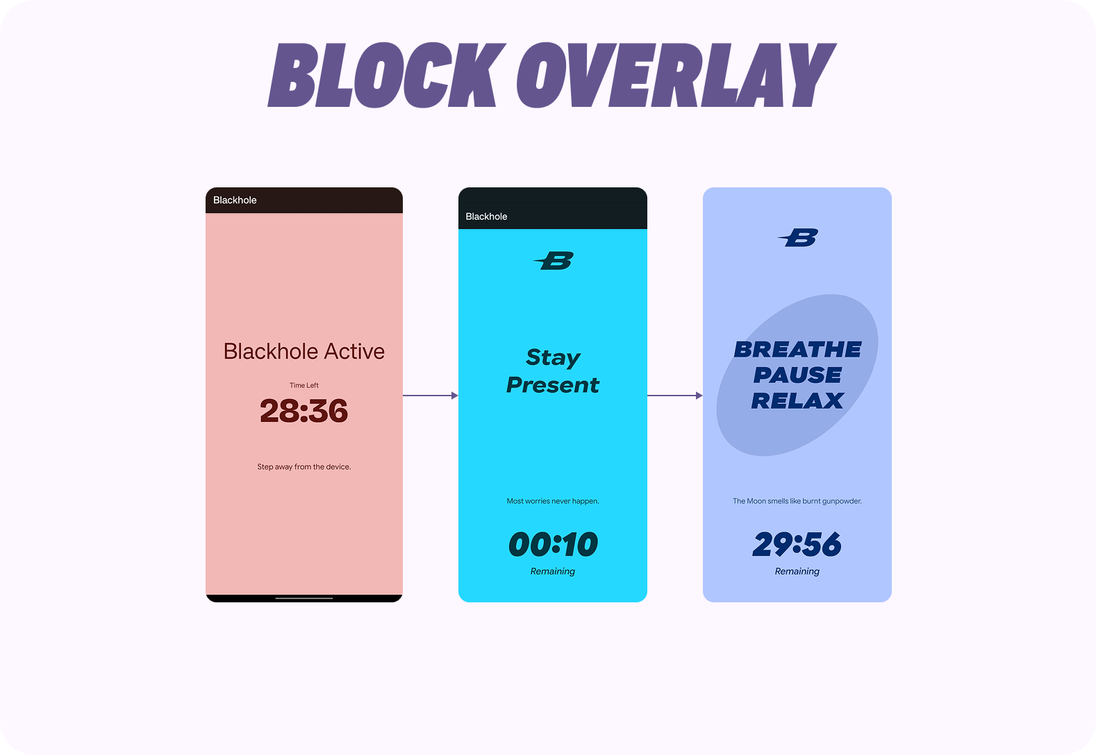
The Intervention: When the timer expires, a full-screen block overlay appears.
UI & UX Decision: Used Bold texts and Meaningful Material shapes morphing animation, with a timer running down to keep the user at ease.
Insight Tiles: A modular dashboard allowing users to customize what data they see (Avg Session, Opens, Streak).
Design Decisions
There were multiple design decisions that were made for adding uniqueness and increase experience of the application.
Design System
To ensure the app felt like a native extension of the user's device rather than an intrusive third-party tool, I strictly adhered to Google's Material 3 guidelines.
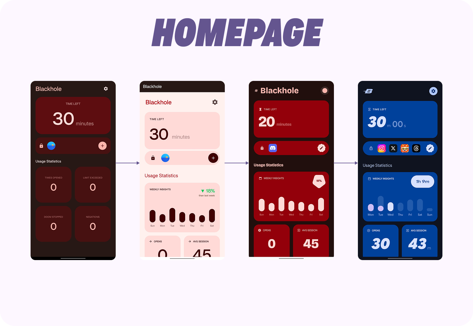
- Dynamic Adaptation: I implemented Android's Dynamic Color engine, allowing the app's UI to automatically extract and adapt color schemas from the user's active wallpaper. This reduces cognitive load. By harmonizing with the user's personal device aesthetic, the app feels "at home" on their phone, increasing trust and reducing the likelihood of uninstalling.
- Google's Native Font: I implemented Google Sans Flex as the primary font due to it's variable sizes and Bold fonts to make the application look native and easily understandable.
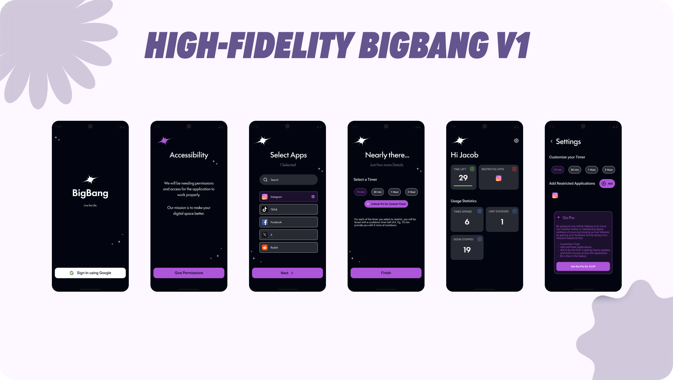
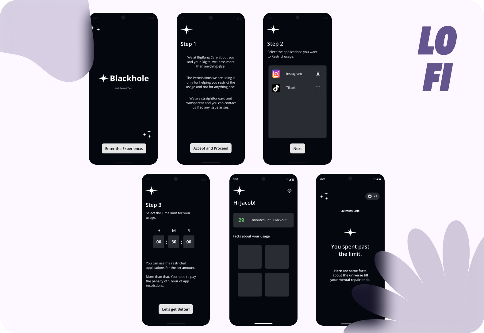
Previous Iteration: The "BigBang" Phase
Before arriving at the final polished interface, I developed an intermediate high-fidelity prototype codenamed "BigBang."
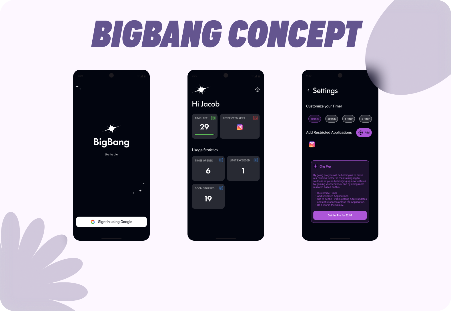
Critique & Evolution: While this version successfully implemented the core logic, internal testing revealed key friction points that I addressed in the final design:
- Static Data: The "Usage Statistics" were mere counters (e.g., "6 Times Opened"). Users couldn't see trends or patterns as formed in the final design.
- Layout Disaster: The layout wasn't well thought out and wasn't friendly to operate which made the screens look lifeless.
- Visual Noise: The heavy purple branding felt overly aggressive for a digital wellbeing tool. This led to the pivot towards the Material theme and cleaner layouts of the final version.
Elemental Decisions
Moving from the previous iteration to the final product involved granular changes to specific UI elements to enhance clarity, calmness and enhance the user experience.
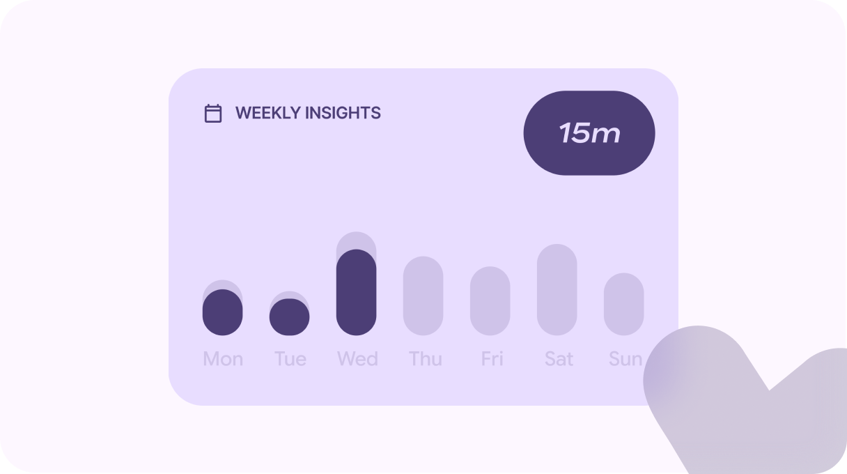
Weekly Insights: Added a new Tile called the "Weekly Insights", which helped the users to check this week's usage and also compare the usage with their last week's statistics. UI decision of tapping the bar changing the usage time helped to keep ~14 days of usage minimal with less navigation. UX wise, having a previous week comparison will nudge the users to use the restricted applications less, indirectly affecting their usage.
Intervention Geometry: For the Block screen, I used dynamic colors and calming texts to help the users stay relaxed while in the break phase. I used the help of Material shapes and added a morphing animation in the background to make the page narrate a story rather than being static.
Oval represents Void, Heart represents being thoughtful, The arrow represents Mobility and the Sun, Flower and 4-Sided cookie represents Nature, in a way forming the meaning of Center → Intend → Reconnect.

Development: The "Agentic" Workflow
As a designer with minimal coding knowledge, I built the MVP myself to ensure the implementation matched the design intent.
Tech Stack: Native Android (Kotlin), Android Studio, Google Antigravity Agentic IDE.
Innovation: I utilized Google's Antigravity Agentic IDE to accelerate development. This allowed me to rapidly prototype complex logic (like the background service for monitoring app usage) and iterate on the UI in real-time.
Application Privacy: The application was engineered to process all the UsageStats locally without sending it to a cloud, making sure the application is perfectly private.
Business Model
To ensure sustainability, I designed a Freemium model that balances user value with monetization.
- Basic (Free): Restrict 2 apps, Standard block timer, 4 Insight tiles. (Sufficient for casual users).
- Premium (One-Time Payment): Unlimited apps, Custom block timers (45m, 1h, etc.), Full Insight customization.
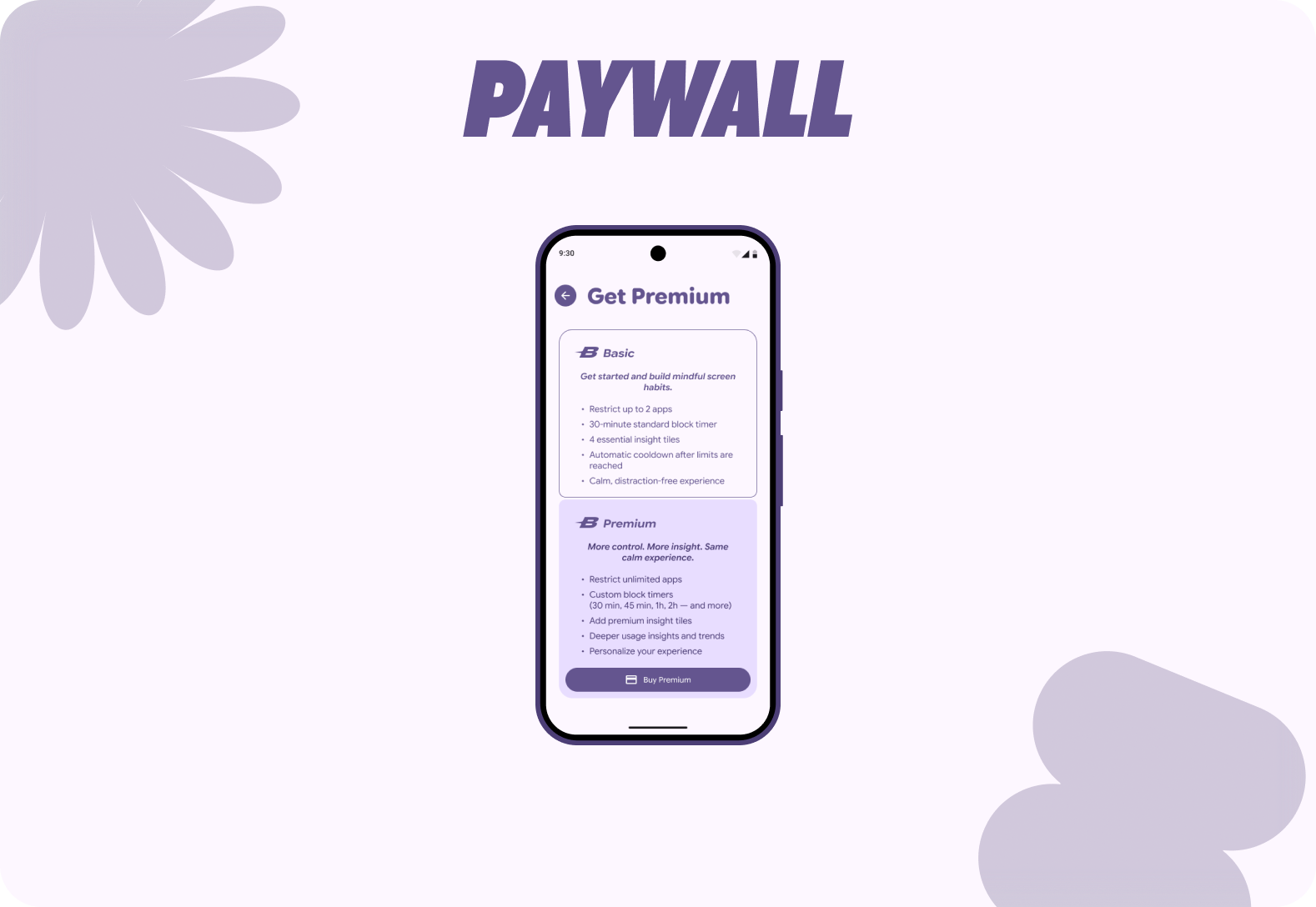
UX Decision: The features moved to premium without limiting the basic function of the application and One-time payment was decided instead of Subscription without draining the user's money.
Results & Next Steps
Current Status: The app is currently in Closed Beta on the Google Play Store, undergoing stability testing with a select group of users.
Future Steps
- Emergency Mode: Making a research with users and finding out a suitable way to add the "Break the Lock" feature without losing the integrity of the application.
- Digital Wellbeing Suite: Adding multiple features in the roadmap to the application after the initial MVP release, without losing the focus of why the application was built.
- iOS Port: Translating the Material 3 design to Apple's Human Interface Guidelines, and standing out from the competition.
If you're interested